本文概要
本文将介绍如下几种常见的布局:
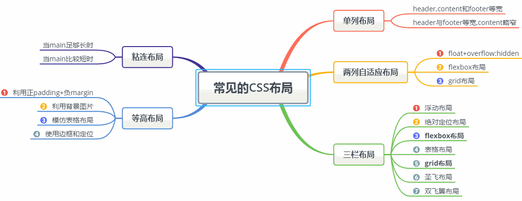
其中实现三栏布局有多种方式,本文着重介绍圣杯布局和双飞翼布局。另外几种可以猛戳实现三栏布局的几种方法
一、单列布局
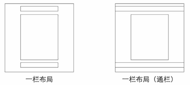
常见的单列布局有两种:
- header,content和footer等宽的单列布局
- header与footer等宽,content略窄的单列布局
1.如何实现
对于第一种,先通过对header,content,footer统一设置width:1000px;或者max-width:1000px(这两者的区别是当屏幕小于1000px时,前者会出现滚动条,后者则不会,显示出实际宽度);然后设置margin:auto实现居中即可得到。
1
2
3
4
5
6
7
8
9
10
11
12
13
14
15
16
17
18
19
20
21
| <div class="header"></div>
<div class="content"></div>
<div class="footer"></div>
.header{
margin:0 auto;
max-width: 960px;
height:100px;
background-color: blue;
}
.content{
margin: 0 auto;
max-width: 960px;
height: 400px;
background-color: aquamarine;
}
.footer{
margin: 0 auto;
max-width: 960px;
height: 100px;
background-color: aqua;
}
|
对于第二种,header、footer的内容宽度不设置,块级元素充满整个屏幕,但header、content和footer的内容区设置同一个width,并通过margin:auto实现居中。
1
2
3
4
5
6
7
8
9
10
11
12
13
14
15
16
17
18
19
20
21
22
23
24
25
26
27
28
29
| <div class="header">
<div class="nav"></div>
</div>
<div class="content"></div>
<div class="footer"></div>
.header{
margin:0 auto;
max-width: 960px;
height:100px;
background-color: blue;
}
.nav{
margin: 0 auto;
max-width: 800px;
background-color: darkgray;
height: 50px;
}
.content{
margin: 0 auto;
max-width: 800px;
height: 400px;
background-color: aquamarine;
}
.footer{
margin: 0 auto;
max-width: 960px;
height: 100px;
background-color: aqua;
}
|
二、两列自适应布局
两列自适应布局是指一列由内容撑开,另一列撑满剩余宽度的布局方式
1.float+overflow:hidden
如果是普通的两列布局,浮动+普通元素的margin便可以实现,但如果是自适应的两列布局,利用float+overflow:hidden便可以实现,这种办法主要通过overflow触发BFC,而BFC不会重叠浮动元素。由于设置overflow:hidden并不会触发IE6-浏览器的haslayout属性,所以需要设置zoom:1来兼容IE6-浏览器。具体代码如下:
1
2
3
4
5
6
7
8
9
10
11
12
13
14
15
16
17
18
19
20
21
| <div class="parent" style="background-color: lightgrey;">
<div class="left" style="background-color: lightblue;">
<p>left</p>
</div>
<div class="right" style="background-color: lightgreen;">
<p>right</p>
<p>right</p>
</div>
</div>
.parent {
overflow: hidden;
zoom: 1;
}
.left {
float: left;
margin-right: 20px;
}
.right {
overflow: hidden;
zoom: 1;
}
|
注意点:如果侧边栏在右边时,注意渲染顺序。即在HTML中,先写侧边栏后写主内容
2.Flex布局
Flex布局,也叫弹性盒子布局,区区简单几行代码就可以实现各种页面的的布局。
1
2
3
4
5
6
7
8
| //html部分同上
.parent {
display:flex;
}
.right {
margin-left:20px;
flex:1;
}
|
3.grid布局
Grid布局,是一个基于网格的二维布局系统,目的是用来优化用户界面设计。
1
2
3
4
5
6
| //html部分同上
.parent {
display:grid;
grid-template-columns:auto 1fr;
grid-gap:20px
}
|
三、三栏布局
特征:中间列自适应宽度,旁边两侧固定宽度
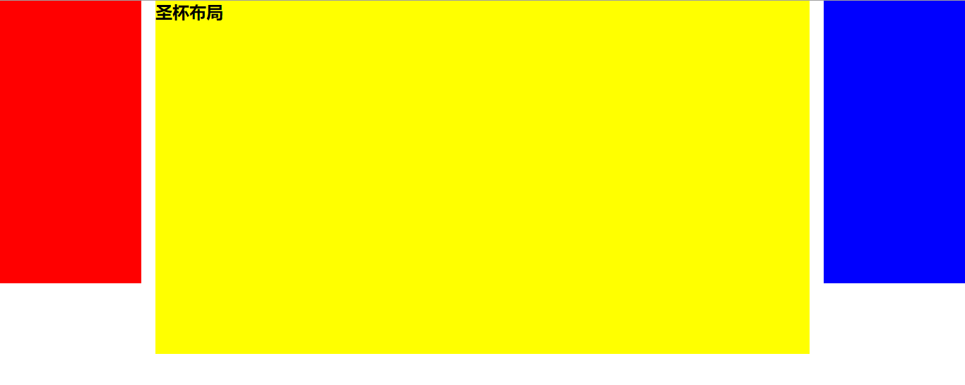
1.圣杯布局
① 特点
比较特殊的三栏布局,同样也是两边固定宽度,中间自适应,唯一区别是dom结构必须是先写中间列部分,这样实现中间列可以优先加载。
1
2
3
4
5
6
7
8
9
10
11
12
13
14
15
16
17
18
19
20
21
22
23
24
25
26
27
28
29
30
31
32
33
34
35
| .container {
padding-left: 220px;
padding-right: 220px;
}
.left {
float: left;
width: 200px;
height: 400px;
background: red;
margin-left: -100%;
position: relative;
left: -220px;
}
.center {
float: left;
width: 100%;
height: 500px;
background: yellow;
}
.right {
float: left;
width: 200px;
height: 400px;
background: blue;
margin-left: -200px;
position: relative;
right: -220px;
}
<article class="container">
<div class="center">
<h2>圣杯布局</h2>
</div>
<div class="left"></div>
<div class="right"></div>
</article>
|
② 实现步骤
- 三个部分都设定为左浮动,否则左右两边内容上不去,就不可能与中间列同一行。然后设置center的宽度为100%(实现中间列内容自适应),此时,left和right部分会跳到下一行
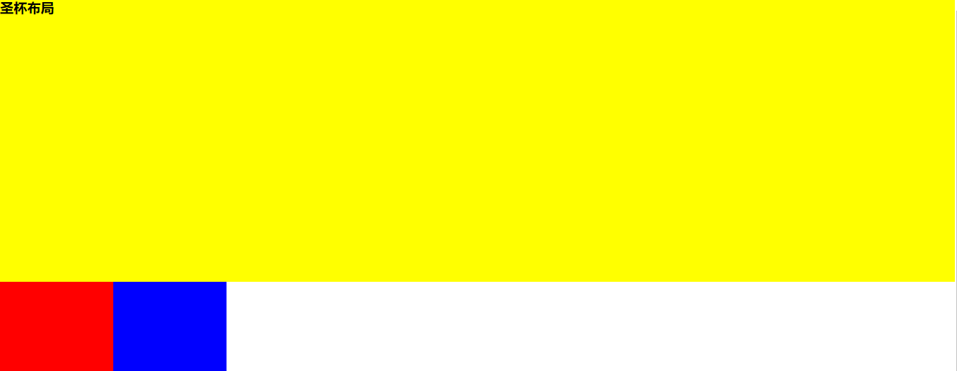
- 通过设置margin-left为负值让left和right部分回到与center部分同一行
- 通过设置父容器的padding-left和padding-right,让左右两边留出间隙。
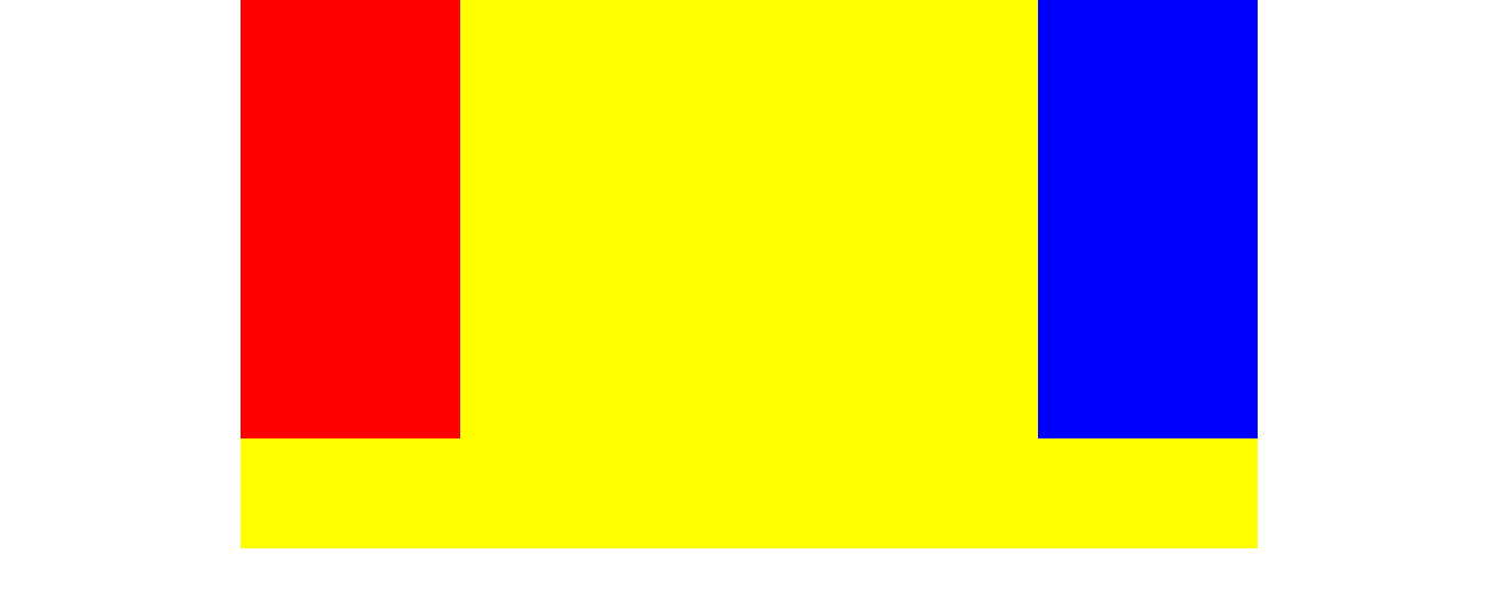
- 通过设置相对定位,让left和right部分移动到两边。
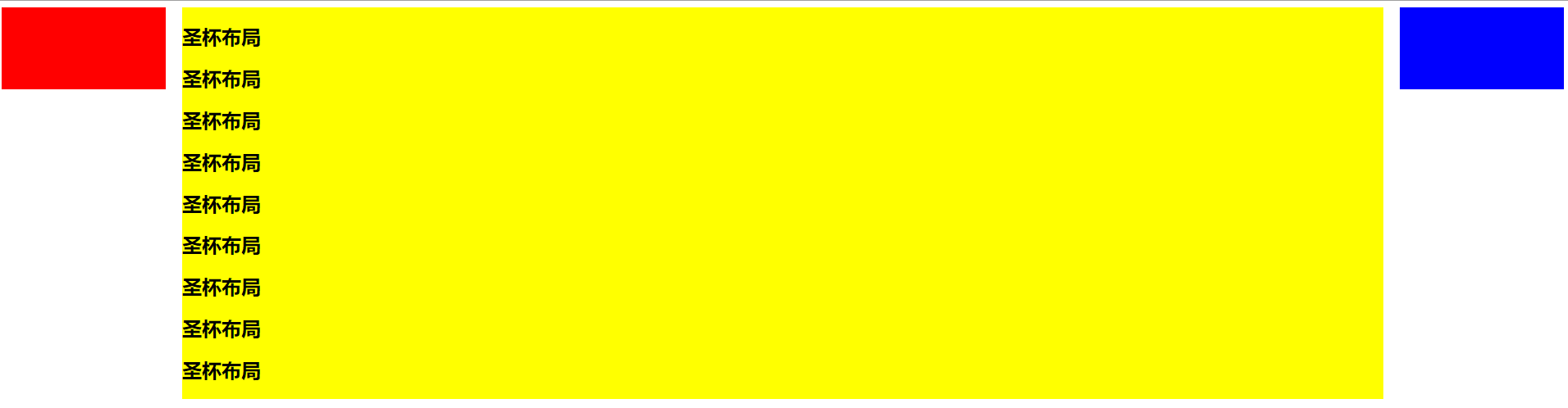
③ 缺点
- center部分的最小宽度不能小于left部分的宽度,否则会left部分掉到下一行
- 如果其中一列内容高度拉长(如下图),其他两列的背景并不会自动填充。(借助等高布局正padding+负margin可解决,下文会介绍)
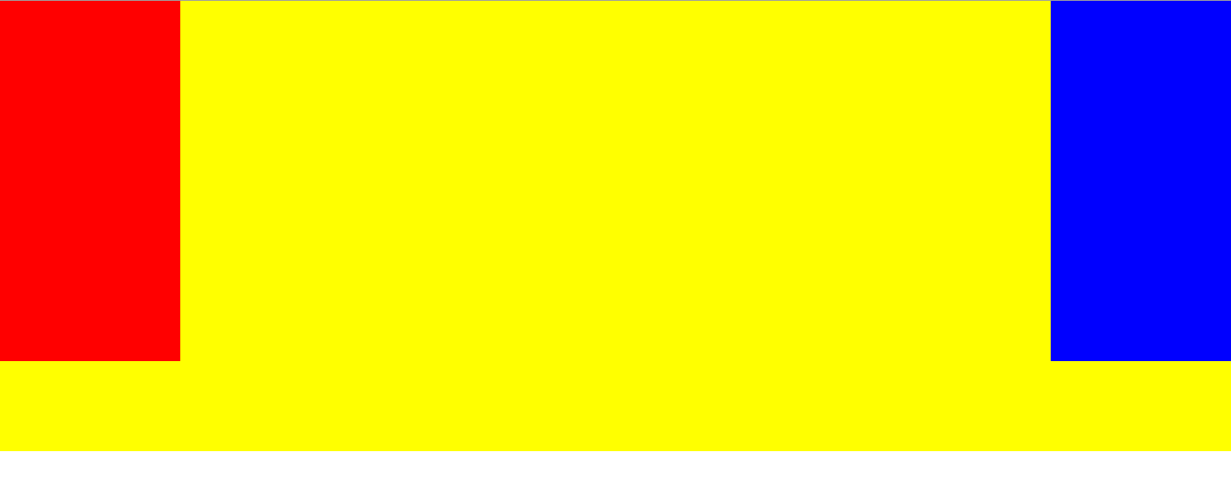
2.双飞翼布局
① 特点
同样也是三栏布局,在圣杯布局基础上进一步优化,解决了圣杯布局错乱问题,实现了内容与布局的分离。而且任何一栏都可以是最高栏,不会出问题。
1
2
3
4
5
6
7
8
9
10
11
12
13
14
15
16
17
18
19
20
21
22
23
24
25
26
27
28
29
30
31
32
33
| .container {
min-width: 600px;
}
.left {
float: left;
width: 200px;
height: 400px;
background: red;
margin-left: -100%;
}
.center {
float: left;
width: 100%;
height: 500px;
background: yellow;
}
.center .inner {
margin: 0 200px;
}
.right {
float: left;
width: 200px;
height: 400px;
background: blue;
margin-left: -200px;
}
<article class="container">
<div class="center">
<div class="inner">双飞翼布局</div>
</div>
<div class="left"></div>
<div class="right"></div>
</article>
|
② 实现步骤(前两步与圣杯布局一样)
- 三个部分都设定为左浮动,然后设置center的宽度为100%,此时,left和right部分会跳到下一行;
- 通过设置margin-left为负值让left和right部分回到与center部分同一行;
- center部分增加一个内层div,并设margin: 0 200px;
③ 缺点
多加一层 dom 树节点,增加渲染树生成的计算量。
3.两种布局实现方式对比:
- 两种布局方式都是把主列放在文档流最前面,使主列优先加载。
- 两种布局方式在实现上也有相同之处,都是让三列浮动,然后通过负外边距形成三列布局。
- 两种布局方式的不同之处在于如何处理中间主列的位置:
圣杯布局是利用父容器的左、右内边距+两个从列相对定位;
双飞翼布局是把主列嵌套在一个新的父级块中利用主列的左、右外边距进行布局调整
四、等高布局
等高布局是指子元素在父元素中高度相等的布局方式。接下来我们介绍常见几种实现方式:
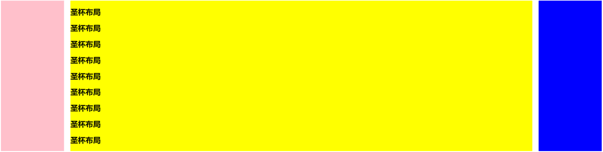
1.利用正padding+负margin
我们通过等布局便可解决圣杯布局的第二点缺点,因为背景是在 padding 区域显示的,设置一个大数值的 padding-bottom,再设置相同数值的负的 margin-bottom,并在所有列外面加上一个容器,并设置 overflow:hidden 把溢出背景切掉。这种可能实现多列等高布局,并且也能实现列与列之间分隔线效果,结构简单,兼容所有浏览器。新增代码如下:
1
2
3
4
5
6
7
8
9
10
11
| .center,
.left,
.right {
padding-bottom: 10000px;
margin-bottom: -10000px;
}
.container {
padding-left: 220px;
padding-right: 220px;
overflow: hidden;//把溢出背景切掉
}
|
2.利用背景图片
这种方法是我们实现等高列最早使用的一种方法,就是使用背景图片,在列的父元素上使用这个背景图进行Y轴的铺放,从而实现一种等高列的假象。实现方法简单,兼容性强,不需要太多的css样式就可以轻松实现,但此方法不适合流体布局等高列的布局。
在制作样式之前需要一张类似下面的背景图:

1
2
3
4
5
6
7
8
9
10
11
12
13
14
15
16
17
18
19
20
21
22
| <div class=”container clearfix”>
<div class=”left”></div>
<div class=”content”></div>
<div class=”right”></div>
</div>
.container {
background: url("column.png") repeat-y;
width: 960px;
margin: 0 auto;
}
.left {
float: left;
width: 220px;
}
.content {
float: left;
width: 480px;
}
.right {
float: left;
width: 220px;
}
|
3.模仿表格布局
这是一种非常简单,易于实现的方法。不过兼容性不好,在ie6-7无法正常运行。
1
2
3
4
5
6
7
8
9
10
11
12
13
14
15
16
17
18
19
20
21
22
23
24
25
26
27
28
29
30
31
32
33
34
35
36
37
38
39
40
41
42
43
| <div class="container table">
<div class="containerInner tableRow">
<div class="column tableCell cell1">
<div class="left aside">
....
</div>
</div>
<div class="column tableCell cell2">
<div class="content section">
...
</div>
</div>
<div class="column tableCell cell3">
<div class="right aside">
...
</div>
</div>
</div>
</div>
.table {
width: auto;
min-width: 1000px;
margin: 0 auto;
padding: 0;
display: table;
}
.tableRow {
display: table-row;
}
.tableCell {
display: table-cell;
width: 33%;
}
.cell1 {
background: #f00;
height: 800px;
}
.cell2 {
background: #0f0;
}
.cell3 {
background: #00f;
}
|
4.使用边框和定位
这种方法是使用边框和绝对定位来实现一个假的高度相等列的效果。结构简单,兼容各浏览器,容易掌握。假设你需要实现一个两列等高布局,侧栏高度要和主内容高度相等。
1
2
3
4
5
6
7
8
9
10
11
12
13
14
15
16
17
18
19
20
21
22
| #wrapper {
width: 960px;
margin: 0 auto;
}
#mainContent {
border-right: 220px solid #dfdfdf;
position: absolute;
width: 740px;
height: 800px;
background: green;
}
#sidebar {
background: #dfdfdf;
margin-left: 740px;
position: absolute;
height: 800px;
width: 220px;
}
<div id="wrapper">
<div id="mainContent">...</div>
<div id="sidebar">...</div>
</div>
|
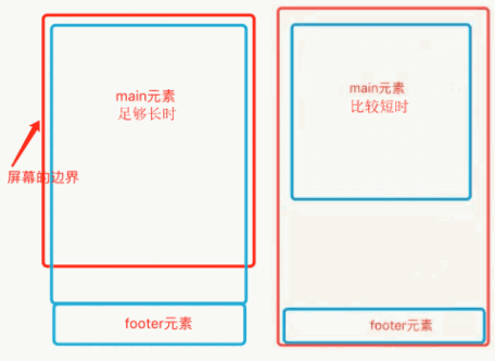
五、粘连布局
1.特点
- 有一块内容
<main>,当<main>的高康足够长的时候,紧跟在<main>后面的元素<footer>会跟在<main>元素的后面。
- 当
<main>元素比较短的时候(比如小于屏幕的高度),我们期望这个<footer>元素能够“粘连”在屏幕的底部
具体代码如下:
1
2
3
4
5
6
7
8
9
10
11
12
13
14
15
16
17
18
19
20
21
22
23
24
25
26
27
28
29
30
31
32
| <div id="wrap">
<div class="main">
main <br />
main <br />
main <br />
</div>
</div>
<div id="footer">footer</div>
* {
margin: 0;
padding: 0;
}
html,
body {
height: 100%;
}
#wrap {
min-height: 100%;
background: pink;
text-align: center;
overflow: hidden;
}
#wrap .main {
padding-bottom: 50px;
}
#footer {
height: 50px;
line-height: 50px;
background: deeppink;
text-align: center;
margin-top: -50px;
}
|
2.实现步骤
(2)wrap区域的高度通过设置min-height,变为视口高度
(4)在main区域需要设置 padding-bottom。这也是为了防止负 margin 导致 footer 覆盖任何实际内容。
参考文章